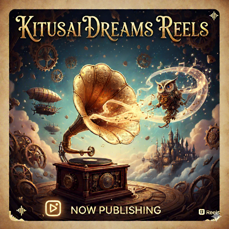

Kitusai.com, New look !
There is a change on the site ! In order to better correspond to the image it wants to transmit, Kitusai has a new look! New colors ! New logo !
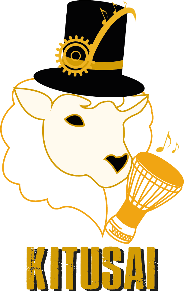
New logo
The logo is composed of various symbols that illustrate Kitusai’s identity:
- The sheep : Kitusai is above all a story that began in a sheepfold deep in the Pyrenees mountains. The sheep represents the origin of Kitusai but also symbolizes the nature that we must preserve.
- The djembe : the percussions are the heart of Kitusai’s musical achievements.
- The top hat and the steampunk style : the musical style of Kitusai is sometimes difficult to define. When we ask Kitusai about the definition of his universe he talks about Jules Vernes and Steampunk.
New colors
Kitusai’s graphic design is based on 3 main colors:
- Sepia/yellow : Sepia is a color articulating the ancient and the modern. It corresponds to the Steampunk universe. It is also a symbol of link between different art forms such as photography and writing. Kitusai also claims this desire of link and artistic mixture. Indeed, Kitusai associates music and visual arts such as painting or photography in order to bring the public to use several of their senses for a better immersion in the proposed universe.
- Black : Black is a neutral and timeless color. It symbolizes wisdom and mystery. In Kitusai’s design, it complements the bright color of sepia/yellow. It offers openness and discovery to the mystery that surrounds the universe transported by Kitusai’s music.
- Grey : Grey refers to black. But it is also a color that we associate with metal. It is therefore part of Kitusai’s Steampunk universe which introduces metallic sounds in his creations.
And a thank you to Emeline who allowed this graphic renewal by giving life to the ideas and the universe of Kitusai.